%20(3).png)
Art Supplies Spotlight: Poems About You Handmade Watercolour Part 2
- Wendyy Nguyen
- Jul 7, 2025
- 3 min read

Updated: Jul 10, 2025
Hi friends,
In this month’s post, I’m excited to share more from my Poems About You handmade watercolour collection. If you missed Part I—where I introduced the small business and swatched some of their beautiful yellows, oranges, reds, and pinks — you can read it here.
In this post, I’ll be diving into the purples and blues in my collection. These shades are my personal favourites, so I have plenty of colours to share with you!

Notes On Each Colour
I have two versions of Violet, both made with PV16—commonly known as Manganese Violet—which is a red-leaning violet. Of the two pans, one was quite difficult to rewet and had low tinting strength, while the other, though still a bit hard to rewet, offered stronger tinting strength and was easier to layer and build up colour. The texture of both was slightly gummy, which is typical of certain pigments like Ultramarine Violet (PV15), Ultramarine Purple (PV15), Lazurite (commonly known as Lapis Lazuli, PB29), and Green Earth (PG23). These pigments are usually highly transparent and tend to require multiple layers to build up a rich, saturated colour.
Ultramarine Violet (warm purple), Ultramarine Purple (cool purple), Lazurite Baikal and Lazurite Afghan were all relatively easy to rewet. While their tinting strength was lower compared to other colours, they shared a slightly gummy texture and high transparency. These paints are well-suited for gentle, layered washes and subtle, atmospheric effects.
In contrast, Dioxazine Violet, Cobalt Purple Tyrian, Indanthrone Blue and Albrecht Blue were incredibly easy to rewet and had very high tinting strength—only a small amount was needed to achieve a rich, saturated colour. These paints tend to be dark and moody, highly transparent, non-granulating, and noticeably staining.
Smalt is an unusual colour that reminds me of Potter’s Pink. It’s heavily granulating due to its large, heavy pigment particles, lifts easily, and is quite transparent.
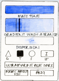
I have three versions of PB29 in my collection - Ultramarine Blue, Ultramarine Blue Dark and Lavender Blue. As expected with PB29, all were easy to rewet, offered good colour payoff, and were transparent. Lavender Blue behaved slightly differently—it had a lower tinting strength and a faintly gummy texture, similar to the more mineral-heavy pigments mentioned earlier.
Moving on to the cobalt pigments, both Cobalt Blue and Cobalt Aquamarine were incredibly high in tinting strength and leaned more towards the semi-opaque side. Cobalt Blue is a warmer, classic mid-blue, while Cobalt Aquamarine leans cooler, almost turquoise or green-tinged. Both are vibrant and versatile, and ideal for bold skies or expressive ocean hues.
I have four variations of the same Phthalo pigment - Phthalo Blue, Cerulean, Primary Blue and Azure. These are my favourite as they allow for clean and vibrant mixes and are not granulating, meaning they won't separate in washes or mixes unlike Ultramarine Blue which generally will separate out of the paint mixture. Phthalo Blue, Cerulean and Primary Blue all had strong tinting strength and were highly transparent. Azure, on the other hand, was almost opaque. In the pan, it appeared as a pastel blue colour and resembled similar characteristics to Cobalt Aquamarine.
Lastly, Transparent Blue and Mayan Blue. Both these blues are a little softer and less vibrant compared to the other blues. They are highly transparent and granulating, with a slightly lower tinting strength.
I hope this overview helps you better understand how these pigments behave so you can choose the right ones for your own palette and painting style.
Swatches
See below for swatches of all the colours.


If you’ve made it this far, thank you so much for reading this blog. Stay tuned for Poems About You III, where I’ll be sharing an even wider range of colours — this time in shades of green and earthy yellows!
I hope you enjoyed this blog post and found it inspiring.
Until next time.
Much love,
Wendy


Comments