%20(3).png)
Art Supplies Spotlight: Poems About You Handmade Watercolor Part 5
- Wendyy Nguyen
- Dec 23, 2025
- 5 min read

Updated: Jan 26
Hi friends,
Welcome back to the blog — and to the second-last instalment of the Poems About You Handmade Watercolors Art Supplies Spotlight series, featuring Earthy Oranges and Earthy Reds. Think Burnt Sienna, Venetian Red, and Indian Red!
If you’d like to catch up on the previous instalments, you can find them here:
Part 2: Purple & Blue colours
Part 3: Green colours
Part 4: Earthy Yellow colours
Earthy oranges and reds, though I don’t include too many in my palette, are incredibly important. They’re wonderful for toning down bright greens and blues, which is essential in botanical artwork. They can also add warmth to cooler greens and blues, helping you achieve a more balanced and natural look.
You can mix them to create mossy greens, olive tones, or muted warm blues, all perfect for painting natural art-supplies-spotlight-poems-about-you-handmade-watercolour-part-5foliage. I also love using earthy oranges to create shadow mixes — for instance, a 1:1 mix of Burnt Sienna and Ultramarine Blue produces a beautiful grey that’s perfect for painting shadows on white flowers or soft shadowed areas in general.
These hues are a must-have if your palette includes bright, bold colours and you want the option to tone them down for more muted, natural, and earthy results.
Most earthy oranges and reds also have a lower tinting strength (with exceptions like Hematite), so they won’t overpower your mixes. Plus, most are lightfast, meaning your colours will stay vibrant over time — a reassuring quality for any botanical artist.

Notes on Each Watercolour Paint/Colour
Earth Oranges
French Orange Ochre (PY43): is quite easy to rewet and produces an opaque masstone, which is unusual for an earthy pigment. Although it is listed as transparent, it leans towards being a semi-transparent to semi-opaque colour.
Travertine Orange (PR102): rewets easily and has a slightly gummy texture, similar to PG23. It has a medium tinting strength and is highly transparent, making it a beautiful option for layered washes.
Mars Orange (PY42): shares similarities with French Orange Ochre, with a very high tinting strength and easy to rewet. It appears semi-opaque in masstone and leans slightly cooler in temperature compared to both French Orange Ochre and Travertine Orange.
Mummy Red Light (PR102): over time can form a thin oxidised layer on the surface of the paint, which requires gentle scrubbing to access the true colour beneath. It has a medium tinting strength and is very transparent, with noticeable granulation.
Neutral Brown Leaning Earth Reds
Red Earth (PR102): is a very thirsty pigment that absorbs large amounts of water. It is extremely granulating, with large, darker particles clearly visible within the paint. It has a slight gummy texture, and brushstrokes remain visible, meaning it does not apply smoothly on the paper. The paint is highly transparent, which is typical of pigments with a gummy consistency. In hue, it leans closer to a brownish orange rather than a true earthy red. In dilute washes, the pigment disperses noticeably, with the larger particles becoming even more prominent.
Transparent Red (PR101): is a warmer red, leaning towards an earthy orange in hue. It is highly transparent and granulating, with visible large particles throughout the wash. Unlike Red Earth, this pigment is smooth to paint with and does not have a gummy texture. In more dilute washes, the pigment separates, with the larger particles becoming more pronounced and settling into a darker tone.
Mummy Pink (PBr7): is a granulating red-brown with a subtle pink undertone. In dilute washes, it separates beautifully into a deeper brown and a dusty pink-brown. The pigment rewets easily and remains transparent and granulating. It is very smooth to paint with, making it particularly pleasant to work with despite its earthy character.
Burnt Sienna (PBr7): is noticeably more brown in hue compared to many Burnt Siennas, which often lean closer to an earthy orange. It appears more opaque when wet and dries to a slightly more transparent finish. The pigment is non-granulating, producing a flatter wash with high tinting strength and good dispersion.
Mummy Bauxite (PR101): has a high tintinghas a high tinting strength and behaves similarly to Blue Ridge Hematite, leaning towards semi-opaque to opaque when wet before drying slightly more transparent. It rewets very easily and disperses significantly in diluted washes, allowing the pigment to move freely across the paper.
Red Ochre (PR102): also has a high tinting strength and rewets with ease. It behaves similarly to Burnt Sienna and Mummy Bauxite, appearing more opaque when wet and drying to a slightly more transparent finish. Unlike some of the other pigments, it does not disperse much in dilute washes, resulting in more controlled and contained applications.
Warm Earth Reds
Ercolano Red (PR102): is very easy to rewet and has a smooth texture. Due to its lack of granulation, it appears quite flat when dry. This is a warm, earthy red that glides onto the paper smoothly. It has a high tinting strength and shows very little dispersion in dilute washes, making it a reliable and controlled pigment to work with.
Pozzuoli Red (PR101): also has a smooth texture and dries flat due to its non-granulating nature. It is slightly opaque and applies smoothly, gliding easily across the paper. Very similar to Ercolano Red, it has a high tinting strength, rewets easily, and shows low dispersion in diluted washes.
Venetian Red (PR101): unlike the other two warm earth reds, Venetian Red is slightly granulating, though it still dries relatively flat. Despite this subtle granulation, the paint remains smooth and glides well on the paper. Like Ercolano Red and Pozzuoli Red, it has a high tinting strength and low dispersion in washes, making it a strong and consistent warm earth pigment.
Cool Earth Reds
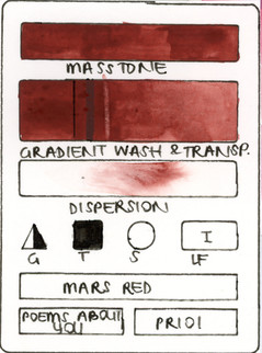
Within my collection of cool earth reds, English Red is the only colour that differs noticeably from Hematite. All other colours listed below are very similar to Hematite, sharing a high tinting strength and appearing highly opaque when wet, before drying slightly more transparent. They sit closely together in hue: a cool, muted red leaning toward brown.
Red Barite (PR102), Terracotta - Maroon Red (PR101), Mars Red (PR101), Indian Red (PR101), Natural Red Oxide - Maroon Red (PR102) : is a dull red that forms a thin film over the paint pan when not used and requires scrubbing to activate and remove in order to acccess the true paint beneath. It dries a little lighter and transparent. When more water is added, it is more granulating and separates into a darker brown and a red.
Hematite Indian Red - Indian Red (PR101:1) and Blue Ridge Hematite - Maroon Red (PR102): are also similar to the above, however, only slightly warmer red brown in mass tone and more red when dilute.
English Red (PR102): is highly granulating, with pronounced texture, and leans more toward brown in hue. It is more transparent overall, becoming only slightly opaque when wet. In dilute washes, it separates into a dark brown and a reddish-brown, and it also has a high tinting strength.
Final Thoughts
Earth oranges and reds can range from being quite subtle to very dominating in any mix. For those that are very transparent, they are good for glazing and slightly altering more vibrant hues to produce more muted tones. As for those that a high tinting and opaque, a little goes a long way and they are probably better use in shadows or for dark objects such as leaves, foliage, branches and stems, adding good contrast to brighter and softer flowers in botanical artwork. If you enjoy natural, grounded palettes, I recommend having at least two earthy orange/red tones!
Swatches
See below for swatches of all the colours.


If you’ve made it this far, thank you so much for reading this blog. Stay tuned for Poems About You VI, where I’ll be sharing the rest of my first Poems About You collection consisting of shades of earthy purples, blues, browns and greys!
I hope you enjoyed this blog post and found it inspiring.
Until next time.
Much love,
Wendy


Comments