%20(3).png)
Art Supplies Spotlight: Poems About You Handmade Watercolor Part 6
- Wendyy Nguyen
- Feb 11
- 6 min read

Hi friends,
Welcome back to the second last installment of the Poems About You Handmade Watercolors Art Supplies Spotlight Series, feauturing the rest of my earthy colours Earthy Purples, Blues, Browns & Greys. Think Purple Ochre, Vivianite Blue, Sepia, Burnt Umber and Payne's Grey!
If you'd like to catch up on the previous blog posts and see all the swatches, you can find them all here:
Part 2: Purple & Blue colours
Part 3: Green colours
Part 4: Earthy Yellow colours
Part 5: Earthy Orange & Red colours
Earthy purples, blues, browns & greys are essentials in my palettes especially when painting botanicals. Not only are they great for muting vibrant colours, but they are also great for shadows especially for white flowers, stems. branches, woody parts of plants as well as dark and deep centres of flowers such as anemones and zinnias.
Some browns I don't even mix and use as is for woody objects and subjects. These colours are a must for botanical artists.
These earthy colours range from low tinting to high tinting and range in opacity so how much you use in mixes is greatly dependent on the pigment. Most of these are lightfast meaning they won't fade over time making them perfect for commission or client work.

Notes on Each Watercolour Paint/Colour
Earth Purples
Crimson Ochre (PR102): is a warm, reddish earth purple. Over time, this paint forms a film over the surface, requiring water and gentle scrubbing to rewet. It has a medium–high tinting strength and is transparent, with more noticeable granulation when applied wet. As it dries, it settles into a flatter finish.
Cadmium Maroon (PR108): is a deep, earthy red-purple and behaves like a typical cadmium pigment. It rewets and reacts very easily, producing an even, flat wash with little to no granulation. With a high tinting strength, it is semi-opaque to opaque and disperses widely when used with plenty of water.
Mars Crimson (PR101): is similar in hue to Cadmium Maroon but leans slightly cooler and more purple. Like some other earth pigments, it forms a film over the surface over time. It has a high tinting strength with a red undertone and dries more transparent, though it appears quite opaque when applied wet-onto-dry.
Tuff Purple (N/A) and Purple Ochre (PR102): are very similar in both hue and behaviour. Both are warm purple earth tones with low tinting strength and can be slightly difficult to load onto the brush. They have a subtle gummy texture, low dispersion, and are highly granulating, with large pigment particles clearly visible in washes. With generous water, both separate into brown and earthy red tones and lift easily from the paper.
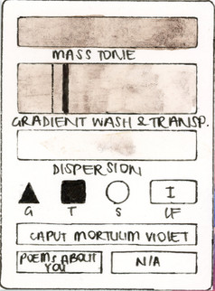
Caput Mortuum (PR101): is a warm, earthy purple. It rewets incredibly easily and is highly textural and granulating. Its high tinting strength makes it appear more opaque when wet, drying down to a slightly more transparent finish.
Caput Mortuum Reddish (N/A): is similar to Caput Mortuum but leans cooler, with a red-purple bias. It also has a very high tinting strength and rewets easily, resulting in a more opaque when applied wet-on-dry. This version is only slightly granulating and, with heavy water dilution, separates into brown and black tones.
Earth Greens
Green Umber (PBr7): is a very high-tinting earth green. For an earth pigment, it is surprisingly flat and non-granulating. It appears opaque when applied wet and dries slightly less opaque. The paint rewets very easily, making it responsive and easy to work with.
Earth Blues
Vivianite Blue (N/A): is similar in behaviour to Caput Mortuum Violet, with a very low tinting strength. It is highly granulating and transparent, with large pigment particles and visible brushstrokes when applied to paper. The hue sits closer to a cool bluish grey, and it lifts incredibly easily from the paper.
Warm & Green Browns
Italian Brown Ochre (PY43): sits closer to an earthy yellow than a true brown, similar in feel to Jarosite or Limonite. It has a low to medium tinting strength, is slightly granulating, very transparent, and easy to rewet.
Chlorite Brown (PBr7): has a low to medium tinting strength and applies very smoothly despite the presence of large, visible pigment particles. Its grainy texture makes brushstrokes apparent on paper. The colour is only slightly opaque due to these larger particles and is otherwise quite transparent. With generous water, it separates into two distinct brown tones.
French Raw Umber (PBr7), Raw Umber Greenish (PBr7) and Raw Umber (PBr7): are very similar in both behaviour and handling, which is unsurprising given they share the same pigment. The primary difference lies in hue, ranging from warm to cooler browns. All rewet very easily, have a low to medium tinting strength, and a slight gummy texture that contributes to their transparent nature. They are only lightly granulating and apply very smoothly on paper.
Raw Umber Very Dary Dark (PBr6): behaves similarly to the PBr7 umbers in that it rewets easily, but it has a medium to high tinting strength and a warm, deep brown hue. It has minimal granulation and dries into a mostly flat wash.
Orange & Red Browns
Mummy Brown (PBr7): is very transparent with a light to medium tinting strength and a slight gummy texture. It is only slightly granulating, with no visible large pigment particles, and has low dispersion when used with generous amounts of water.
Burnt Umber Brownish (PBr6), Burnt Umber Reddish (PBr8), Burnt Umber (PBr7): are very similar in both behaviour and appearance, with a medium to high tinting strength. They apply very smoothly on paper and are non-granulating, drying into a flat, even wash. In masstone they appear more opaque, but dry slightly more transparent. With heavy water dilution, all three separate into a reddish brown and a darker, cooler brown.
Burnt Umber Cyprus (PBr6) and Burnt Umber Very Dark (PBr7) - are closely related, sharing a medium to high tinting strength and very smooth application. Both are non-granulating and dry quite flat. They appear more opaque in masstone but dry to a slightly more transparent finish. With lots of water, both separate into a warm brown and a dark, cool brown.
Cool Deep Browns
Caput Mortuum Violet (N/A): is unlike the other Caput Mortuum colours. Rather than having a high tinting strength, it is very low-tinting, highly granulating, and transparent. The pigment contains visibly large particles, which means brushstrokes remain clearly visible when applied to paper. It leans toward a warm brown hue and creates beautifully textured washes.
Gilsonite (NBk6): has a low to medium tinting strength and a slightly gummy texture. It is heavily granulating, with large black pigment particles clearly visible on the paper. Similar to Caput Mortuum Violet, these large particles result in visible brushstrokes. Despite this, Gilsonite remains very transparent and produces rich, earthy darks.
Cadmium Brown (PBr36): is a very dark, deep brown that appears almost black in masstone. Like other cadmium pigments (such as Cadmium Maroon), it rewets easily and behaves in a predictable, controlled way. It is non-granulating, fairly flat, and semi-opaque, leaning more toward opaque. Washes appear even in colour and texture, and the pigment disperses readily when diluted with plenty of water.
Cassel Earth (NBr8) and Sepia (NBr8, PBk8, PBk11, NBk6): are very similar in behaviour, with the main difference being their pigment composition—Sepia is a blend of four different earth pigments. Both colours are deep, dark browns that appear almost black in masstone. On paper, they apply smoothly with minimal granulation and dry very flat. Neither has a gummy texture, and both remain very transparent despite their depth of colour.
Greys
Payne's Grey (PBk7, PB29): is a cool-leaning grey that appears almost black in masstone. Despite containing PB29 (a pigment known for granulation), it behaves smoothly and remains non-granulating. It dries flat and becomes noticeably more transparent once dry, making it a versatile and understated neutral.
Final Thoughts
Earthy purples, greens, blues, and browns can range from low to very high tinting strength, making them incredibly versatile when creating a particular colour or mood. I most often use these pigments to tone down very vibrant colours or for foliage such as stems and branches — the quiet fillers and backbone that help bring a composition together.
If you are a botanical artist, I highly recommend having a few earthy colours in your palette.
Swatches
See below for swatches of all the colours.


If you’ve made it this far, thank you so much for reading this blog post. Stay tuned for Poems About You VII, where I’ll be sharing some of the more unusual colours from my Poems About You collection that I picked up at a later date. This includes new releases, back-in-stock mineral paints, and rare pigments — I think you’ll really love this one.
After that, we’ll be moving on to exploring two collections from RuCo Paints.
I hope you enjoyed this post and found it both inspiring and helpful.
Until next time.
Much love,
Wendy


Comments